




Home
-
Weffort Motorized Shades Daily News
-
Stop Buying Stark White: Why the Blinds.com Cotton Color Looks Better

Stop Buying Stark White: Why the Blinds.com Cotton Color Looks Better
by Yuvien Royer on Apr 27 2026
I spent three weeks obsessing over Zigbee signal strength and motor torque specs, only to realize I was about to make the biggest rookie mistake in the book: ordering 'Stark White.' I wanted my living room to feel like a high-end tech retreat, but pure white shades often end up looking like a sterile dental office or a hospital wing. After fumbling through a dozen swatches, I eventually settled on the blinds.com cotton color, and it completely saved my design sanity.
Quick Takeaways
- Cotton offers a warm, organic hue that avoids the 'blue-ish' tint of stark white fabrics.
- The slightly off-white tone hides household dust and pet dander significantly better than pure white.
- It diffuses midday sun into a soft, inviting glow rather than a harsh glare.
- The subtle texture makes motorized shades look like high-end window furniture instead of plastic utilities.
The Builder-Grade White Smart Home Trap
Most of us start our automation journey with the defaults. We buy the white smart bulbs, the white sensors, and eventually, the white motorized shades. We think they will blend into the walls, but the reality is often disappointing. Pure white fabrics, especially in cellular or roller shades, often have a cold, blue undertone that makes a room feel uninviting when the shades are fully deployed.
When you have five windows closing simultaneously at sunset via a HomeKit scene, that wall of stark white can feel aggressive. It doesn't look like fabric; it looks like a series of projector screens. It screams 'utility' rather than 'comfort.' This is why choosing a color with a bit of soul is the first step to a setup you actually enjoy living with.
What Does the Blinds.com Cotton Color Actually Look Like?
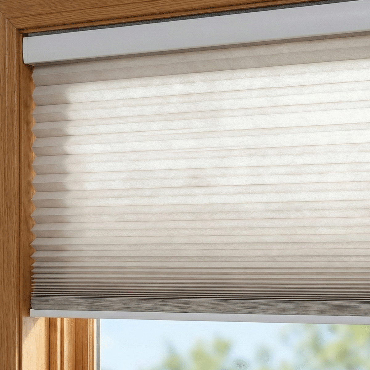
The 'Cotton' hue is a masterclass in neutral balance. It isn't yellow, and it isn't beige. It is more like a heavy cream or a very light oatmeal. When I held it up against a standard sheet of 20lb printer paper, the difference was immediate. The printer paper looked cold and synthetic, while the cotton swatch felt natural and soft. It is a near-perfect match for popular paint colors like Sherwin Williams Alabaster or Benjamin Moore White Dove.
If you are currently staring at a screen trying to decide, stop. You need to see how the light in your specific room hits the material. I highly recommend learning how to pick the perfect color for your cellular shades by ordering physical samples. Seeing the cotton color next to your actual wall paint at 2 PM and 8 PM is the only way to avoid a return shipment headache.
How Smart Schedules and Sunlight Change the Fabric
One of the coolest things about this specific fabric is how it reacts to my automation schedules. At 10 AM, when the sun hits my south-facing windows, the cotton fabric catches the light and glows. It creates a diffused, warm atmosphere that makes the room feel larger. Flat, stark white shades tend to bounce light back, creating hot spots that can actually make it harder to see your TV or computer screen.
During the 'Golden Hour,' my Home Assistant setup lowers the shades to 75% to prevent glare. The way the orange-red sunset light interacts with the cotton hue is stunning. This layered color and feel can redefine any room, turning a simple window covering into a design feature that changes character throughout the day. It adds a level of depth that makes the automation feel intentional rather than just a tech gimmick.
Does It Match White Window Trim and Smart Sensors?
A common concern is whether an off-white shade will clash with bright white window trim or the white plastic of your smart home gear. My window trim is painted in a standard semi-gloss white, and my Eve Motion sensors and Zigbee motor end-caps are also bright white. Surprisingly, the contrast is a benefit. The slight variance in shade creates a 'designer look'—it makes the shades look like a deliberate textile choice rather than a cheap plastic insert.
The motors themselves—which usually have a noise floor under 35dB—are tucked away, but the fabric is what you see. Having that soft 'Cotton' texture against the sharp lines of the white trim provides a visual break that is much easier on the eyes. It makes the whole window assembly look more expensive than it actually was.
My Verdict After 6 Months of Automated Living
After half a year of these shades raising and lowering daily, I am sold. The biggest win hasn't just been the look, but the maintenance. Pure white shades show every speck of grey dust and every tiny spider web. The cotton tone is incredibly forgiving. I've only had to use a canned air duster on them once.
I did have one 'smart home moment' where my Zigbee gateway decided to update its firmware at 3 AM, causing the shades to lose their limits and start grinding. It was a terrifying sound, but after a quick recalibration and a firmware patch, they were back to normal. If you want a setup that looks high-end and handles the realities of a dusty, sun-drenched home, skip the stark white and go with the cotton.
FAQ
Is the cotton color too yellow for a modern home?
Not at all. It is a true neutral off-white. It only looks 'yellow' if you place it directly against a blue-toned cool white, but on its own, it just looks like a soft, natural fabric.
Does it provide enough privacy at night?
Yes. While it is light-filtering, the weave is tight enough that people outside can only see vague shadows and light, even when your interior smart lights are at 100% brightness.
Will it match my white smart sensors?
The contrast actually looks better than a 'near-miss' match. The white plastic of a motion sensor or motor cap looks like a clean accent against the warmer fabric of the shade.