



Home
-
Weffort Motorized Shades Daily News
-
Are Purple Blinds Actually Tacky, or Just Misunderstood?

Are Purple Blinds Actually Tacky, or Just Misunderstood?
by Yuvien Royer on May 28 2026
I stood in my living room last Tuesday at 4 PM, staring at my 'Minimalist Gray' setup. It felt like a high-end dentist’s office. I needed color, but I was terrified that purple blinds would turn my adult sanctuary into a 1996 Claire’s boutique. I’ve spent years installing Zigbee motors and fighting with bridge offsets, only to realize that the tech didn't matter if the room felt cold.
Quick Takeaways
- Deep plum and eggplant tones absorb more light than standard charcoal, making them superior for media rooms.
- Lavender filters sunlight into a warm, flattering glow that mimics a permanent golden hour.
- Automating bold colors makes them feel like a design choice rather than an accident.
- Texture is vital; a lavender roman shade softens the look compared to rigid plastic slats.
The Problem With the 'Smart Home Gray' Aesthetic
If you follow the smart home world, you’ve seen the look. It’s all brushed aluminum, white plastic, and 'Urban Pebble' gray. We’ve become so obsessed with making our tech disappear that we’ve accidentally sucked the soul out of our homes. When I first considered purple window shades, my inner critic screamed. I thought it would look like a DIY project gone wrong or a leftover from a teenage bedroom makeover. But after staring at my gray walls for three years, I realized that 'safe' was just another word for 'boring.'
The risk with purple blinds for windows is that people often choose the wrong saturation. They go for a neon grape or a flat, synthetic violet. That’s where the tackiness lives. To make this work, you have to treat the window treatment as a piece of architecture. I started by looking at how light interacts with the fabric. A smart home shouldn't just be about opening and closing things with your voice; it should be about controlling the vibe of the room. By choosing a muted, dusty purple, I found I could inject warmth without making the room feel like a cartoon.
I’ve installed enough motorized kits to know that the hardware is the easy part. The hard part is living with the color when the sun is at its peak. I decided to swap my standard gray rollers for something with depth. I wanted a space that felt moody and expensive, like a boutique hotel lounge at midnight. It turns out that purple window blinds are the secret weapon for that exact atmosphere, provided you aren't afraid to go dark.
Getting the Hue Right: From Lavender to Dark Plum
Color temperature is everything. In my home office, I didn't want the heavy, oppressive feeling of a blackout curtain. I needed something that felt airy but still had personality. I opted for a lavender roman shade. Because of the way the fabric stacks, you get these beautiful variations in color intensity where the light hits the folds. It’s a much more sophisticated look than your standard lavender mini blinds, which can feel a bit 'dorm room' if you aren't careful.
When you're choosing between lavender blinds and something deeper, look at your walls. If you have cool-toned walls, a lavender window shade adds a layer of softness. If you have dark, moody walls, go for the dark purple blinds. I’ve found that Why I Swapped My Techy Roller Shades For Contemporary Roman Blinds is a philosophy that applies perfectly here; the soft folds of a roman shade handle lighter lavender colors much better than a flat, rigid roller. The texture breaks up the color so it doesn't overwhelm the eye.
For those who prefer a more modern, streamlined look, purple roller shades in a matte finish can work beautifully. The key is to avoid anything with a high-shine or metallic finish. I once tried a set of lavender window blinds with a glossy coating, and it looked like I’d hung up strips of candy wrappers. Stick to natural-looking weaves or high-quality synthetics that mimic linen. Even purple mini blinds can look upscale if the finish is matte and the hardware is color-matched to the window frame.
Why Dark Purple Blinds Are a Home Theater Cheat Code
If you’re building a media room, your first instinct is probably black. It’s the standard. But black can feel flat and cavernous when the lights are on. I discovered that dark purple blinds—specifically in a deep plum or eggplant—actually do a better job of creating a cinematic experience. These tones are incredible at absorbing stray light from your OLED or projector without making the room feel like a literal hole in the ground. When I was looking for the right base, I used the Dark Series Motorized Blackout Roller Shades hardware and paired it with a custom dark purple blackout fabric.
The science is simple: deep purples sit on the cool end of the spectrum and don't reflect light the way a warm gray or a cheap black fabric might. When the movie starts and my 'Cinema' scene triggers, the purple blind drops, and the room goes into total lockdown. The motor noise on these is under 35dB, so you don't even hear them moving over the sound of the popcorn machine. It’s a much more 'pro' feel than standard purple roller shades.
I also experimented with mauve roller blinds in the back of the theater room. Mauve is the perfect middle ground—it has enough gray in it to feel neutral but enough purple to feel intentional. It adds a layer of luxury that black just can't touch. If you’re worried about the 'tacky' factor, this is your safe zone. It’s sophisticated, understated, and looks incredible under dimmable LED pot lights.
The Accidental 'Golden Hour' Effect
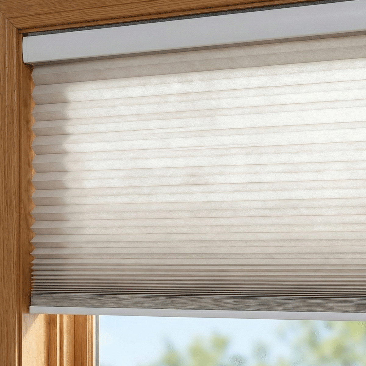
The most surprising part of this whole experiment wasn't how the shades looked when they were closed—it was how they looked when they were half-open. I installed purple cellular shades in the west-facing sunroom. During the afternoon, the sun hits the honeycomb structure and creates this diffused, glowing effect. Instead of the harsh, blinding white light you get with standard neutrals, the room is bathed in a soft lavender light.
This isn't just about aesthetics; it's about how you feel in the space. I’ve found that the light filtered through lavender window shades is incredibly calming. It’s like having a sunset filter on your windows all day long. If you're using lavender mini blinds, you can tilt the slats to bounce this light off the ceiling, filling the room with a subtle, purple-tinted glow that makes skin tones look great. It’s a total cheat code for looking better on Zoom calls.
I’ve also played around with purple day and night blinds. These are great because they allow you to alternate between a sheer lavender stripe and a solid purple one. It gives you way more control over the light than a standard purple roller blind. You can essentially 'tune' the color of the room by adjusting how much of the sheer fabric is exposed. It’s the closest thing to having a physical color temperature slider for your natural light.
Syncing Purple Roller Shades to Smart Lighting Scenes
This is where the 'smart' part of the smart home actually pays off. I don't just want my purple window blinds to move; I want them to participate in the room's lighting design. I used a Zigbee-based hub to group my mauve roller blinds with a set of Philips Hue bulbs. I programmed a 'Lounge' scene that triggers at sunset. As the sun goes down, the Roller Shades descend to 100% closed, and the smart bulbs dim to a warm 2200K.
The warm light from the bulbs hits the purple fabric and creates this incredibly rich, deep glow. It’s a vibe you just can't get with white or gray shades. Because I’m using a purple roller blind with a slight texture, the artificial light catches the weave and adds depth to the window. I’ve found that pairing purple with warm-dim lighting is the key to making the color look expensive. If you use cool white light (5000K+), the purple will look clinical and cheap. Stick to the warm stuff.
I did hit one snag during the setup. My hub decided to drop the connection to the bedroom shades during a firmware update at 2 AM. The motor just sat there humming like a frustrated bee until I manually reset the limit positions. It’s a reminder that even with the best colors, you’re still at the mercy of your WiFi. But once I got the 'Alexa, Goodnight' routine dialed in, seeing those dark purple blinds slide down in unison made all the troubleshooting worth it.
The Verdict: Should You Put Purple Blinds in Your Windows?
So, are they tacky? Only if you’re lazy about it. If you throw up some cheap, shiny lavender mini blinds and call it a day, yeah, it’s going to look like a bad 90s throwback. But if you invest in high-quality fabrics—like a heavy purple roman shade or a matte purple roller blind—you can create a space that feels more curated than anything you’d find in a 'safe' gray home.
If you're a beginner, start with lavender window shades in a smaller room like a bathroom or a home office. See how the light changes throughout the day. If you’re a home theater nerd, stop buying black and look at dark purple blinds. They’re better at light control and look ten times more expensive. Smart homes are about customization, and there’s nothing more custom than a perfectly executed purple lighting scene. Don't let the fear of a 90s bedroom stop you from having a home with actual personality.
FAQ
Do purple blinds fade in the sun?
Any fabric will fade over time, but high-quality purple window shades treated with UV inhibitors hold up well. If you’re worried, go with a lavender roman shade—the lighter color shows fading much less than deep plums or navy-purples.
Will purple blinds make my room look smaller?
Dark purple blinds will definitely make a room feel more enclosed and 'cozy.' If you have a tiny space, stick to lavender blinds or light-filtering purple cellular shades to keep the room feeling open while still getting that pop of color.
Are they hard to match with furniture?
Purple is surprisingly versatile. It looks incredible with gold or brass hardware, dark wood, and even emerald green accents. Just avoid pairing it with too many other primary colors or you’ll end up with a space that feels chaotic rather than curated.