



Home
-
Weffort Motorized Shades Daily News
-
Blinds and Shades Color Selection Guide: Optical Dynamics, Palette Matching, and Smart Automation

Blinds and Shades Color Selection Guide: Optical Dynamics, Palette Matching, and Smart Automation
by Yuvien Royer on Sep 21 2026
The Optical Science of Window Covering Colors: Reflection vs. Absorption
Choosing the right hue for your window treatments involves far more than matching paint chips. When evaluating blinds com colors, understanding how pigments interact with natural light is fundamental to achieving both visual comfort and functional light control. Light-colored fabrics—such as soft whites, creams, and pale grays—reflect a substantial portion of incoming solar energy. This surface reflection diffuses daylight across a room, creating an airy, bright atmosphere while softening intense direct glare.
Conversely, darker textiles like charcoal, espresso, and deep navy absorb more visible light and solar radiation. While dark fabrics reduce the total amount of light bouncing around an interior space, they offer a distinct optical advantage: superior view-through clarity when woven into solar screens. Because dark yarns cut down internal glare and do not wash out under intense sunbeams, the human eye easily focuses past the mesh to the outdoor scenery. Fabric color interacts directly with weave density, as detailed in our guide to choosing roller blinds and shades for your windows.
Categorizing the Palette: From Crisp Neutrals to Rich Statement Hues
Navigating collections like blinds.com shades reveals a broad spectrum of color families, each serving specific interior design roles:
- Crisp and Cool Whites: These shades create a clean, contemporary edge that pairs seamlessly with modern architecture, cool-toned marble, and minimalist trim work.
- Warm Whites and Creams: Soft, warm-leaning neutrals introduce coziness without visually dominating a room. They complement traditional hardwood moldings, brass hardware, and warm flooring.
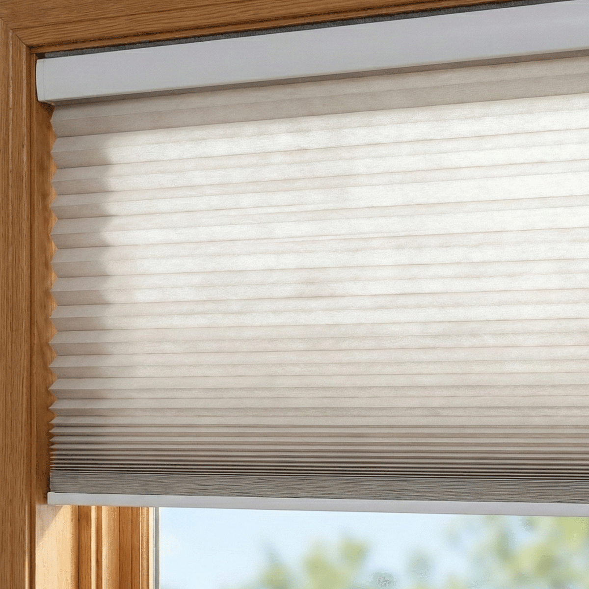
- Earthy Taupes and Beiges: These grounding neutrals bridge the gap between crisp modern lines and organic materials such as linen, rattan, and light oak.
- Charcoal, Slate, and Black: High-contrast architectural tones add drama, frame window geometry, and establish a grounded perimeter in rooms with expansive glazing.
- Bold Accent Hues: Saturated jewel tones, forest greens, and deep marine blues turn window banks into focal points, creating deliberate visual anchors within eclectic or maximalist settings.
Room Orientation and Ambient Lighting: How Exposure Alters Hue Perception
The natural light entering your home changes color temperature continuously throughout the day, significantly shifting how window treatment colors appear against your walls:
Northern Exposure: North-facing windows receive indirect, cool, and slightly bluish daylight. Pure stark whites can appear chilly or gray in these spaces. Selecting fabrics with gentle creamy or warm beige undertones helps balance the naturally cool ambient daylight.
Southern Exposure: Southern orientations receive intense, golden sunlight for the majority of the day. Warm tones may intensify under this yellow-gold wash, whereas neutral grays, taupes, and soft whites maintain balanced clarity without feeling overly warm.
Eastern and Western Exposures: East-facing rooms experience bright, warm dawn rays that shift into cooler shade by afternoon, while west-facing rooms transition from neutral daylight into dramatic, warm afternoon glare. Versatile mid-tone neutrals maintain consistency despite these shifting sun angles.
Artificial lighting also plays a major role. Warm incandescent fixtures enhance rich yellows and earth tones, whereas high-Kelvin LED fixtures can draw out blue and green undertones in gray fabrics.
Architectural Coordination: Matching Window Frames, Trim, and Wall Colors
When selecting blinds com colors, consider whether your goal is seamless blending or architectural contrast. When coordinating fabric swatches with layered drapery, explore our guide on styling shades and blinds for cohesive interior spaces.
For a monochromatic, unified look, match your shade fabric as closely as possible to the window casing or surrounding wall paint. This approach visually expands smaller rooms and keeps the focus on furniture and art. Alternatively, contrasting a dark shade against white trim creates a defined, graphic frame that highlights the structural lines of your windows.
For rooms requiring daylighting while maintaining lower-wall privacy, consider bottom-up window blinds and shades in light-filtering tones that harmoniously blend with lower sill profiles.
Physical Swatch Testing vs. Online Digital Displays
Digital screens render colors using backlit RGB pixels, which cannot fully replicate how natural ambient light reflects off physical fabric fibers. Screen calibrations vary widely, meaning the shade hue you see on a monitor may differ subtly from the physical product in your home.
Always order physical material swatches before finalizing your window treatment order. When your swatches arrive, tape them directly to the window frame or glass rather than laying them flat on a table. Observe how the fabric color, weave texture, and opacity appear at morning, midday, and dusk under both natural daylight and your evening artificial lighting.
Integrating Smart Motorization to Protect and Showcase Fabric Colors
Ultraviolet radiation from prolonged sunlight exposure can gradually degrade pigments and fade textiles over time. Smart motorized shades provide a practical solution for preserving the vibrancy of your chosen window covering colors.
By integrating automated schedules or ambient light sensors, motorized treatments can automatically adjust positions during peak daylight hours. This protective automation shields delicate fabrics, flooring, and interior furniture from sun bleaching while maintaining comfortable indoor temperatures. In the evening, synchronized movement smoothly transitions your window treatments to display rich interior textures and colors, creating an inviting nighttime environment.
Summary Decision Checklist for Choosing Your Window Treatment Color
- Evaluate Optical Goals: Decide whether your primary objective is diffusing glare with lighter fabrics or preserving exterior views with darker weave structures.
- Account for Compass Orientation: Balance cool northern light with warmer undertones, and stabilize bright southern light with balanced neutrals.
- Align with Millwork and Trim: Choose whether shades should disappear into the trim or establish bold architectural contrast.
- Test Physical Samples In Situ: Review swatches vertically against your windows across different times of day.
- Incorporate Automation: Leverage smart motorization routines to protect color vibrancy against direct sun exposure.
Share